
Western Digital | Innovation brandmark Pitch
CREATIVE DIRECTOR, Senior DESIGNER
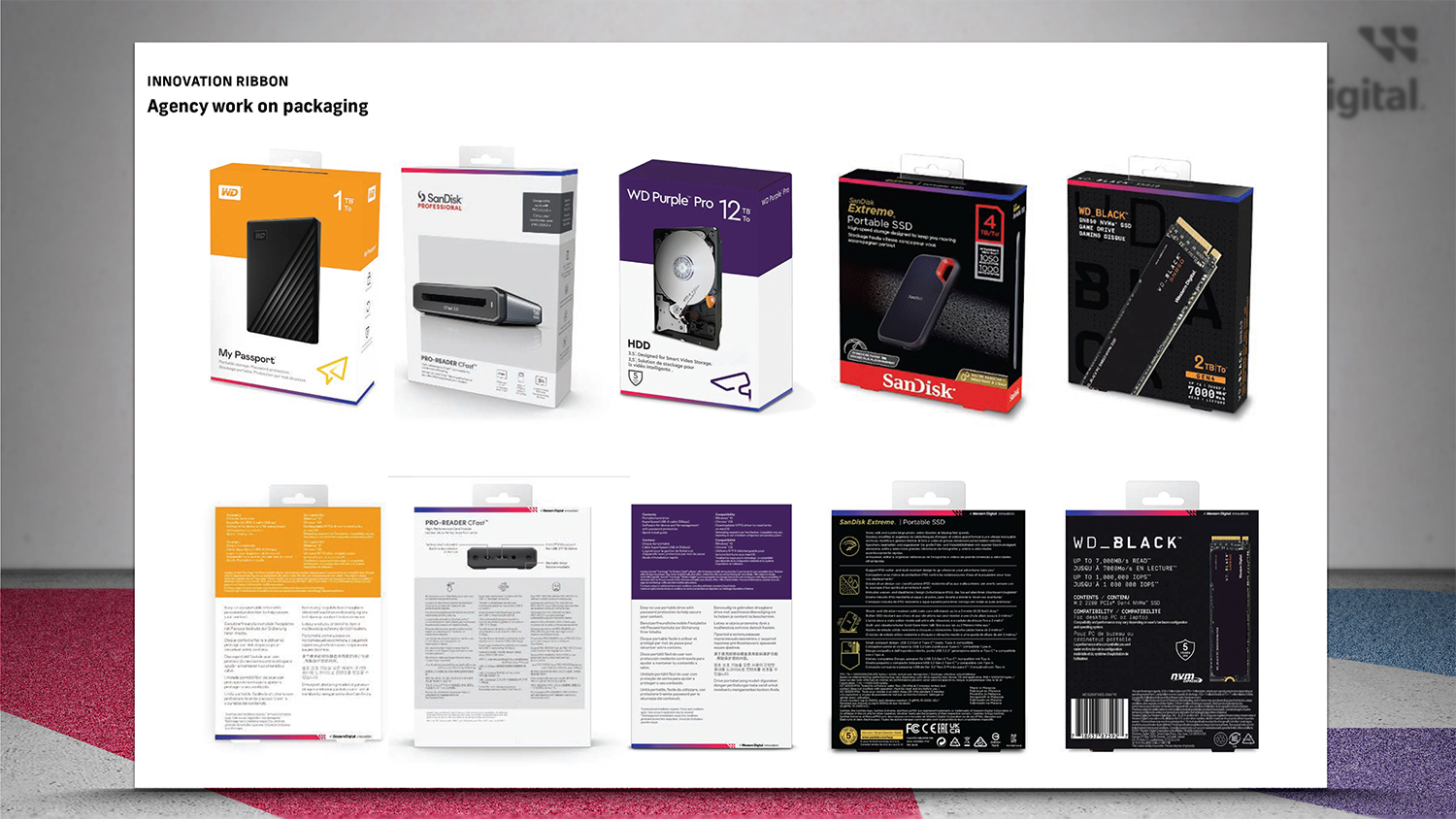
The new Western Digital corporate identity brought several new initiatives, including the CEO’s challenge to design a unifying element across all packaging. Initially started by an external agency, my team and I redesigned, pitched and delivered the final design system.
Optimizing Agency Concept for Real world execution
Project: Optimize the new graphic mark for all packaging
Role: Creative Director and Senior Designer
Specs: Dependent on packaging form factors and product brands
Timing: 5 weeks
The initial Western Digital Innovation mark was a colorful ribbon developed by an external agency. Unconvinced the agency’s proposal could work across all the product brands, my team had to pressure test the concept across 20 form factors and integrate within four unique product brand design systems. And we needed to propose a new solution if the agency work was suboptimal.
I briefed my team to go down two paths: timeless and trendy. I had two concerns about the colorful gradient. First, the colorful gradient was completely disconnected from the product brands and I worried about the disruption on packaging and all product communications in the store. Second, when the trend changes, slow moving product will look out of date on the shelf. Then the company is forced to decide to spend money on deep discounts or expensive buy-backs to flush the older design.
Here’s an abbreviated version of the presentation to the executive team.


Here’s the final design
While the colorful gradient is very much on trend, I successfully advocated for the timeless, one-color approach that integrated with the existing product brands.